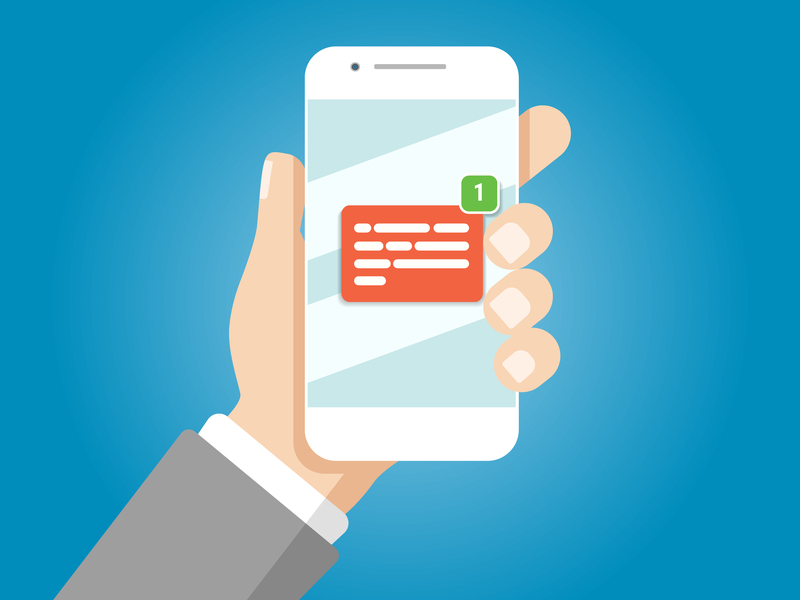
Mobile email design, like web design has been through serious changes since the heavy adoption of mobile devices as the main or secondary places people receive email. At least 61% of users now open email on mobile devices, and 31% report that a smartphone is their primary device to click through and purchase.
If your business isn’t optimizing every email for mobile, or if it’s been a while since you’ve looked at your email strategy to make sure mobile is a central part of it, this would be a good time.
Here are a few ways to improve your email design for mobile.
1. Keep it Simple: use a single column
Multi-column designs were a useful way to put more information on the screen when that screen was more likely to be the desktop monitor. Today, creating an email design with a single column layout that has a responsive width and font is the best way to create an email that looks and behaves great on mobile.
However, if multi-column is still your preferred way to go, creating a responsive email template with multiple columns on a desktop monitor will stack the content content on mobile. That said, you should pay close attention to the content orientation so it stacks in the order you want it to. You can achieve this with a responsive template, which is provided by most of the email-marketing services like Mailchimp and Constant Contact.
2. Resize images and fonts
Increasing or decreasing font sizes and images is a solid way to create a better user experience on all devices. This is usually done automatically on the services mentioned in #1above, but can be done manually using “media queries” and the related stylesheet (if you’re into that kind of thing).
3. Get right to the point
Since you only have a small screen size to get your message across, and almost all devices are full of distractions, stick to short, sharp messaging and avoid long, wordy emails (like this one).
4. Use touch-active buttons
Make your Call-To-Action a button when possible, and give it plenty of room on mobile. Create space around any text links so users can comfortably scroll without accidentally clicking a link and then becoming annoyed at your email. This can be achieved by setting the text links off with special characters (>) or through the use of bold, italics, or underline.
At least 44px width is recommended by Apple for touchable buttons on its iPhone. Remember that you can also make some of the area around the button active as part of the same link, as long as it’s not too close to other buttons.
5. High contrast helps
Mobile users are conscious of battery life and screen brightness. By using high contrast designs, you’ll get better readability. Mobile users may be opening your email outside in bright sunlight and the added contrast can really make a difference.
6. Streamline content
Whether it’s via their phone network or WiFi, mobile users are never wired into the internet. Connectivity issues, signal strength, WiFi speed and even phone memory can impact an email’s load time.
We recommend you keep the code for your emails as light as possible (under the 100kb Gmail-clipping limit) and images are optimized to be as small a file size as possible. This will increase the chance of your email loading and rendering the way you want. Add “Alt Text” to images in case the connection is so slow images cannot load. This not only serves as a good backup for your communication intent, it also serves to make your email more accessible in total to those with vision impairments.
7. Make a smooth landing
After all this effort to make your email mobile friendly, it would be a shame if the subsequent messaging was less impactful. Think in terms of the entire experience your users will have by reading your email and clicking through to your landing page. Make sure that landing page is also mobile-friendly, has a natural connection to the style and message of the email, and contains a great call-to-action that gives you the results you are working for.
8. Test, test, test!
It only takes a few more minutes and is well worth the time to test your email on as many devices and email clients as you can. You may not only find design improvements you need to make, but you can often find content issues that need attention when seeing them from a different angle.
